Chat View & Messaging
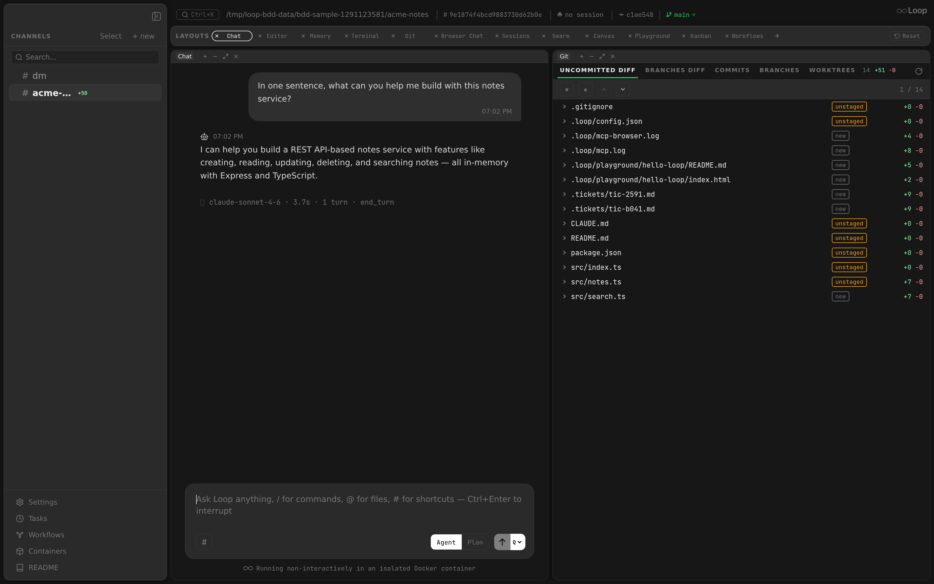
The chat view is the primary interface for interacting with the Loop agent. It displays a conversation timeline with message bubbles, real-time streaming, agent activity indicators, and a multi-mode input area.
Related docs: Layouts | Sidebar | Settings
Architecture
The ChatView component (src/components/chat/ChatView.tsx) receives a ChatState object as props. The state is managed by the useChatState hook, which is hoisted in WorkspaceLayout so the WebSocket connection and messages persist across layout tab switches. See Layouts - Chat State Hoisting
.
ChatState Interface
interface ChatState {
  messages: Message[];
  loading: boolean;
  loadMore: () => void;
  hasMore: boolean;
  addMessage: (msg: Message) => void;
  streamingContent: string | null;
  isRunning: boolean;
  toolActivity: { tool_name: string; input: string } | null;
  agentActivity: AgentActivityData | null;
  askUserQuestions: AskUserQuestionData | null;
  exitPlanRequest: ExitPlanModeData | null;
  todos: TodoWriteData | null;
  gateApproval: GateApprovalRequestedData | null;
  clearAskUser: () => void;
  clearExitPlan: () => void;
  clearGateApproval: () => void;
  mode: "agent" | "plan";
  setMode: (mode: "agent" | "plan") => void;
  completionInfo: { duration_ms?: number; num_turns?: number; stop_reason?: string; model?: string } | null;
  triggerContent: string | null;
}
The isRunning flag is scoped per agent run via a run_id tracked internally by the state hooks. When a scheduled task and a chat agent run concurrently on the same channel, each has a unique run_id — the task completing only clears its own running state, not the chat agent’s.
Message Rendering
Bot Messages (Left-Aligned)
- Aligned to the left (
alignItems: "flex-start") - No background color (transparent)
- Robot icon SVG in the header (antenna, eyes, mouth)
- Timestamp displayed next to the robot icon
- Rounded corners:
18px 18px 18px 4px(bottom-left is sharp)
Hovering a bot message fades in a square-on-square copy button in the top-right corner of the bubble; it copies the raw message content and briefly flips to a check.
User Messages (Right-Aligned)
- Aligned to the right (
alignItems: "flex-end") - Dark background (
#2f2f2f) - No icon in header; timestamp shown below the message
- Rounded corners:
18px 18px 4px 18px(bottom-right is sharp) - When the agent is processing, the last user message shows an eyes indicator (processing indicator)
- Max width: 85% of the container
Highlighted Messages
When jumping to a message from search, the target message receives:
- Background:
rgba(99, 102, 241, 0.15)(indigo flash) - Extra padding:
4px 8px - CSS transition:
background-color 0.5s ease - The highlight fades after 2 seconds via
setTimeout
Each message has a data-msg-id attribute for scroll targeting.
Markdown Support
Messages are rendered through the MarkdownContent component, which uses a custom line-by-line parser.
Block-Level Elements
| Element | Syntax | Rendering |
|---|---|---|
| Fenced code block | ``` … ``` | <pre> with colors.surface background, 8px border-radius, 13px monospace font |
| Language label | ```go | Shown above the code block in colors.textDim, 11px font |
| Paragraph | Any non-empty line | <p> with 2px vertical margin |
| Empty line | Blank line | <br> |
Inline Elements
| Element | Syntax | Rendering |
|---|---|---|
| Inline code | `code` | <code> with colors.surface background, 3px border-radius, 13px monospace font |
| Bold | **text** | <strong> |
| Italic | *text* | <em> |
Inline elements are parsed via regex: /(`[^`]+`|\*\*[^*]+\*\*|\*[^*]+\*)/
File Links
Paths that look like files in the channel’s working tree are auto-detected in both message text and tool-use input blocks, validated against the loop fs, and rendered as clickable links. Clicking opens the file in the editor panel and scrolls to the parsed line.
Detection
A regex (app/src/utils/fileLinks.ts) extracts candidates from rendered text:
- Relative paths with at least one
/and a file extension (src/foo.ts,internal/api/server.go) - Absolute paths starting with
/(e.g./Users/me/dev/loop/main.go) - Optional trailing
:NNNline suffix is captured separately so the click can jump to that line - URLs (
https://…,file://…) are excluded
Tool-use blocks dispatch on tool name. Tools whose tool_input summary is itself a bare path — Read, Edit, Write, MultiEdit, NotebookEdit, NotebookRead — render the entire input as a single link. All other tools (Bash, Grep, Glob, …) fall back to the same regex pass over their input string, so paths embedded in commands or queries still link.
Validation
Candidates are batched per channel and POSTed to /api/channels/{id}/files/exists
, with the result cached. While a candidate is pending or unknown, the link renders as plain text — layout stays stable, no flicker. Once validated:
- Exists → renders as an underlined link in
colors.active - Does not exist → continues to render as plain text
Click Behavior
Clicking a valid link dispatches a loop:open-file CustomEvent with the resolved { rootIndex, relPath } and optional line number. The WorkspaceLayout handler:
- Adds an Editor leaf if none exists, placed opposite the Chat panel horizontally (so chat stays on one side and the editor lands on the other).
- Calls
openFileAtLine(pathKey, line)on the editor state. If the file is already loaded, the scroll happens immediately; otherwise the requested line is queued and flushed once the file content is ready.
The editor centers the target line and focuses the view. When line is null the file simply opens at the top.
Image Paste
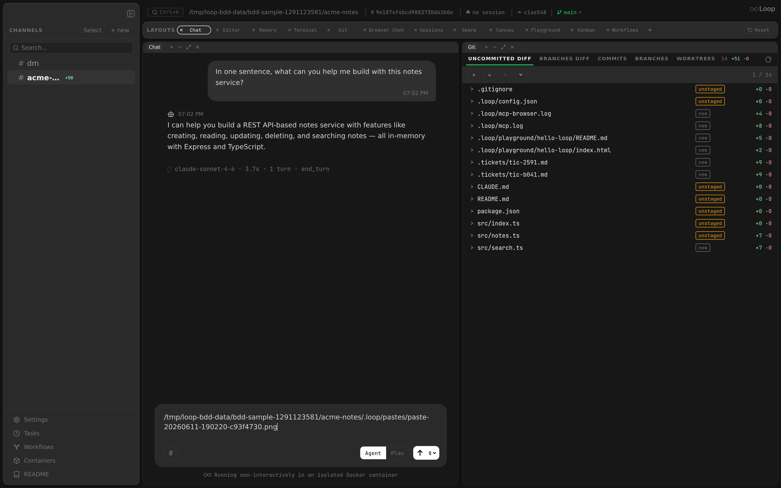
Paste an image straight into the chat input (⌘/Ctrl-V). Loop saves it under the channel workspace’s .loop/pastes/ directory and inserts the saved file path into the composer at the cursor — no upload dialog — so the agent reads it on the next message. The same paste works in the agent terminal
.
Streaming
When the agent is generating a response, the chat view shows a streaming bubble:
- A
message.streamingevent arrives via the WebSocket event stream with partial content. - The
StreamingBubblecomponent renders with:- Robot icon (same as bot messages)
- Italic “streaming…” label next to the timestamp
- Incrementally rendered markdown content
- When the full message arrives (
message.createdwithis_bot: true), the streaming content is cleared and the final message is added to the messages list.
Agent Activity Indicators
While the agent is running, activity events are shown between the last message and the streaming bubble.
Activity Types
| Activity | Icon | Display |
|---|---|---|
model | Robot emoji | Model name (e.g., “claude-sonnet-4-20250514”) |
subagent_started | Link emoji | “Agent: " + description |
subagent_progress | Magnifying glass emoji | Description text |
Activity text is truncated to 100 characters maximum with “…” appended.
Tool Use Indicator
When the agent invokes a tool (tool.use event), an indicator is appended to the timeline:
- Gear icon
- Tool name in bold
- Input summary (collapsed to a one-line preview at 80 chars, except for path-bearing tools whose entire input is rendered as a clickable file link )
Click to expand: clicking a long input (e.g. a multi-line Bash command) toggles the full command, pre-wrapped; clicking the expanded command collapses it back — the same click-to-toggle used for the result below it. The backend caps the tool-input summary at 2000 chars (a safety net, not a display limit), so the whole command survives to the client.
When the matching tool.result event arrives (paired by tool_use_id), the indicator collapses into a tool_use + tool_result pair rendered together — the result is shown as a dimmed second line beneath the tool call, itself click-expandable past 120 chars. Tool calls and their results are persisted as timeline rows, so reloading the channel replays them in chain order alongside the surrounding messages.
Copy buttons: hovering the indicator fades in a small square-on-square copy button at the end of the command line and another at the result — each copies the raw text to the clipboard and briefly flips to a check.
Thinking Bubble
When extended thinking is enabled and the agent emits a thinking block (agent.thinking event), the chat renders a collapsible ThinkingBubble:
- Brain icon header with a dim background
- Default collapsed; click to expand the full text
- Persisted as a
kind: "thinking"timeline row, so it survives reloads in its original chain position
Each thinking and tool block is truncated server-side at 8 KiB; truncated rows render the prefix with a small “(truncated)” hint.
Reply Grouping
On reload, ChatMessages.groupTimelineItems routes every bot reply and agent event (thinking, tool_use, tool_result, compacting) under the user message that triggered its run, using the trigger_msg_id field stamped on the row at insert time. This survives out-of-order processing: when a priority-bumped message (e.g. “Deny with prompt”) runs ahead of older queued ones, its events still group under it instead of attaching by array position to whichever neighbouring user row happens to be next in the timeline.
Orphans — events whose trigger_msg_id points outside the currently loaded window (e.g. paginated away) or pre-feature rows that pre-date the column — fall through to positional grouping so reloading an older page still renders cleanly.
Queued user messages act as routing boundaries. While a prior trigger’s run is still streaming events and the user queues a new message, that queued message holds its insertion position: any events from the prior trigger that arrive after the queued message stop routing back under the prior trigger and render below it via positional grouping. Without this, the prior trigger’s bucket of routed events would keep growing and push the queued message ever further down the timeline. Once the queued message starts processing (no longer in the backend queue), routing resumes as normal and the prior trigger’s later events snap back under it.
Completion Summary
After the agent finishes a run, a completion summary is displayed:
- Timer icon
- Parts joined with " . " separator:
- Model name (if available)
- Duration in seconds (e.g., “12.3s”)
- Turn count (e.g., “5 turns”)
- Stop reason (e.g., “end_turn”)
The summary is only shown when the agent is not running and completion info is available.
Gate Approval Card
When the agent container hits a gate rule with decision: approve, the backend broadcasts a gate.approval_requested
WebSocket event. The chat state stores the payload on gateApproval and ChatMessages renders an ApprovalCard between the last message and the streaming bubble.
Card Content
- Header:
Gate · {KIND}where kind isCONNECT,EXECVE, orDOCKER-HTTP. - Target: the full target string (socket path, command line, or
METHOD /path) in a monospace style. - Message: the matching rule’s
messagefield, shown as a second-line caption when non-empty. - Details: for
DOCKER-HTTPprompts on/containers/create,/containers/{id}/exec,/networks/create, and/volumes/create, the proxy extracts the security-relevant body fields (e.g.cmd,user,privileged,binds) and the card renders them as a sortedkey: valuelist under the target. See Gates: Body details surfaced in the prompt for the full key set per endpoint. - Buttons: three monospace controls, left-to-right:
Allow once— primary accent, lets this one syscall through.Allow for session— secondary outline, caches the allow for the container’s lifetime.Deny ▾— warning accent split button. Clicking the label body rejects the syscall and lets the agent carry on from the denial; this is the only non-terminal deny, which is why it stays the default action. The▾caret opens aContextMenuanchored under it with the variants that change what happens after the denial:Deny for session— sends thedeny-sessiondecision, which caches the denial under the request’s cache key for the container’s lifetime. An agent that retries the same blocked operation is refused without re-prompting.Deny & stop run— denies the gate and then issues/loop stop, ending the run instead of letting the agent continue. The orchestrator’s drain loop claims the next queued message as soon as the cancelled run returns, so this is how to abandon the current run and move straight to what’s waiting behind it. Omitted in terminal panes, where the agent is a TUI on the pane’s stdin rather than the orchestrator run that owns the queue.Deny with prompt…— expands an inline textarea below the card: typing a follow-up and hittingEnter(Shift+Enterfor a newline) denies the gate, cancels the now-resumed run, and immediately sends the prompt withinterrupt=trueso it claims the next slot ahead of any queued messages (without deleting them — see Message Queue Indicators ).
Every menu entry re-checks that no decision is already in flight, since the caret only guards menu-open: a peer window’s click can resolve the card while the menu sits open. While a button is busy it shows a dim “…” label; failures are rendered below the buttons in the warning color so the user can retry.
Dock bounce
While a gate prompt is pending and no Loop window is focused, the desktop app calls app.dock.bounce("critical") on macOS (or flashFrame(true) on Windows/Linux) on a 2-second interval until the user focuses Loop. The bounce is driven from the renderer via approval-needed / approval-resolved IPC messages keyed by req_id, so multiple concurrent gates all clear cleanly. Focus or resolution stops the loop and cancels any in-flight bounce. Turn-end bounces use bounce("informational") instead and fire only once per unfocused window session — a chain of agent turns or scheduled completions still nudges the dock just once.
The bouncer’s pending-id set is also reconciled on every WebSocket reconnect: useChatStateStore’s onOpen snapshots /api/gate/approvals
and hands the canonical req_id list back to electron-main via the reconcile-approvals IPC. Any bouncer entry not present in the snapshot is dropped and the loop stops if the set is empty — this is what prevents an orphaned dock-bounce when a gate.approval_resolved event was missed (daemon restart, network blip, deny-by-timeout fired while the renderer was disconnected). See Gates: WS-reconnect rehydration
for the renderer-state half of the same reconciliation.
Resolution
Clicking a button calls resolveGateApproval(reqId, decision) which POSTs to /api/gate/approvals/{id}
with {decision}. On success the component calls its onResolved callback, which clears gateApproval on the chat state and scrolls to the bottom.
Sending a message while a gate prompt is showing has the same effect as the Deny with prompt… flow: the input auto-denies the pending gate first, then sends the message with interrupt=true. ChatInput receives the pending req_id via the pendingGateReqId prop and routes the send accordingly.
The backend also broadcasts gate.approval_resolved
so any other connected client dismisses the card. Because the desktop doesn’t send author_id, the server records the decision under local.DefaultAuthorID.
Terminal-panel overlay variant
The same ApprovalCard component (extracted to src/components/chat/ApprovalCard.tsx) is also rendered as a dimmed, centered overlay inside each Docker Agent Terminal panel. When a layout has no Chat panel visible (for example, a Swarm layout with three Docker Agents side-by-side), the panel’s own terminal gets the approval prompt layered on top of the xterm so the operator can decide without switching layouts. The overlay sits in the Terminal’s position: relative content region, uses a rgba(0,0,0,0.55) backdrop, and renders the card with its default margin reset (style={{ margin: 0 }}) so it fits the 520-px-wide popover. Resolution uses the same POST /api/gate/approvals/{id} path; clearGateApproval is passed as onGateApprovalResolved so dismissing from one surface dismisses on all of them.
Chat Input
The input area (ChatInput component) sits at the bottom of the chat view.
Layout
- Container:
max-width: 768px, rounded (16px border-radius),colors.surfacebackground - Textarea: 3 rows, transparent background, 14px sans-serif font, no resize
- Mode toggle pill (left of send button)
- Send/Stop button (right)
Mode Toggle
A pill-shaped segmented control with two options:
| Mode | Behavior |
|---|---|
| Agent | Default mode. Message is sent as a regular prompt. |
| Plan | Message is sent with mode: "plan". The agent plans but does not execute. |
The active segment has white background with black text; inactive has transparent background with dimmed text.
Send Actions
| Action | Trigger |
|---|---|
| Send message | Press Enter (without Shift) |
| New line | Press Shift+Enter |
| Send with opposite mode (Queue ↔ Interrupt) | ⌘+Enter on macOS / Ctrl+Enter elsewhere — flips the active send mode for this send only without changing the persisted preference |
| Stop running agent | Click the Stop button (square icon with colors.textDim border) |
The send button:
- Not running: White circle with up-arrow icon. Disabled (40% opacity) when textarea is empty. A small
QorINTchip on the button indicates the active send mode. - Running: Transparent with dimmed border, contains a filled square (stop) icon. Pressing Stop is optimistic — the UI flips to “not running” immediately and re-syncs when
agent.statuslands.
After sending, the textarea is cleared and re-focused via requestAnimationFrame.
Send Mode (Queue vs Interrupt)
While the agent is running, a small chip beside the send button selects what Enter does. Click the chip to flip between the two modes; the choice is persisted in localStorage under loop-send-mode.
| Mode | Behavior |
|---|---|
Queue (default, Q) | Message is appended to the queue and processed when the current run finishes. |
Interrupt (INT) | Cancels the active run and sends the message with interrupt=true. The server inserts it at priority = MaxQueuedPriority + 1 so it claims the next slot ahead of any already-queued rows; queued rows are preserved (not deleted). |
⌘/Ctrl+Enter sends with the opposite mode for one send only (it does not persist). The button tooltip and placeholder reflect the active mode and the keyboard hint at all times.
When the agent is not running, the send mode is irrelevant — every send is just a normal message.
Paste Images
When the clipboard contains an image (file kind, image/png|jpeg|gif|webp), ChatInput’s onPaste handler intercepts the paste, base64-encodes the bytes, and POSTs them to /api/channels/{id}/paste-image
. The backend writes the image under <workspace>/.loop/pastes/paste-<ts>-<rand>.<ext> and returns the absolute path. The renderer inserts that path at the caret position so the next send carries it verbatim — the agent’s built-in Read tool then picks the file up (it requires absolute paths). Non-image clipboard content falls through to the default textarea paste.
This keeps the message body plain text — no multimodal payload is sent over the wire — and reuses the editor’s inline image rendering when the pasted path is clicked in the timeline.
Quote Reply
Clicking a quote button on a bot message stages it as a reply target above the input. The next send prepends the bot’s content as block-quoted lines (> …) before the new prompt, then clears the quote. The staged quote can be dismissed without sending via the × button next to the preview.
Command Autocomplete
Typing / or /loop triggers command autocomplete.
Trigger Logic
- If the text starts with
/and is a partial match for/loop, show all commands. - If the text starts with
/loop, filter commands by partial subcommand name. - If the text already has a subcommand + arguments (space after subcommand), hide the picker.
Available Commands
| Command | Description |
|---|---|
/loop tasks | List scheduled tasks |
/loop task <id> | Show task details |
/loop schedule | Schedule a new task |
/loop cancel <id> | Cancel a task |
/loop toggle <id> | Enable/disable a task |
/loop edit <id> | Edit a task |
/loop status | Check bot status |
/loop stop | Stop active run |
/loop readme | Show README |
/loop template-add <name> | Add a template |
/loop template-list | List templates |
/loop allow_user <id> | Grant user access |
/loop deny_user <id> | Revoke user access |
/loop iamtheowner | Claim channel ownership |
Dropdown UI
- Appears above the input (positioned with
bottom: 100%) - Dark sidebar background with border, 8px border-radius, shadow
- Max height: 280px with scrollable area
- Each item shows: command name (bold, 13px mono), description (12px sans), usage (11px mono, dimmed)
- Selected item:
colors.selectedBgbackground
Navigation
| Key | Action |
|---|---|
ArrowDown | Move selection down |
ArrowUp | Move selection up |
Tab / Enter | Accept selected command |
Escape | Close dropdown |
Accepting a command fills the textarea with /loop <command> (with trailing space).
Prompt Shortcuts
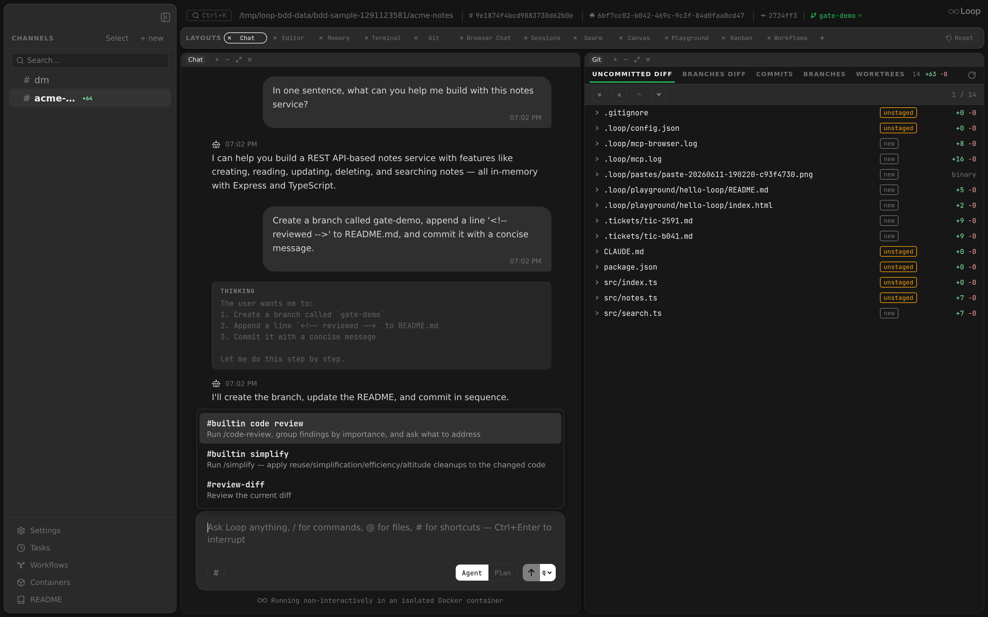
Typing # in the chat input triggers a shortcut picker. Shortcuts are defined in the prompt_shortcuts config array (global or per-project). See Configuration: Prompt Shortcuts
.
Trigger Logic
- If the text starts with
#, show all available shortcuts. - If the text starts with
#followed by characters, filter shortcuts by name prefix. - If there are no matching shortcuts, hide the picker.
Shortcut Button
When shortcuts are available, a # button appears to the left of the mode toggle. Clicking it opens the full shortcut list.
Accepting a Shortcut
Selecting a shortcut (via click, Tab, or Enter) clears the input and immediately sends the shortcut’s resolved prompt as a message. The placeholder text changes to “Ask Loop anything, / for commands, # for shortcuts” when shortcuts are loaded.
Dropdown UI
- Same styling as command autocomplete: dark background, border, shadow
- Each item shows: shortcut name (bold), description (dimmed)
- Selected item:
colors.selectedBgbackground
Navigation
| Key | Action |
|---|---|
ArrowDown | Move selection down |
ArrowUp | Move selection up |
Tab / Enter | Accept selected shortcut |
Escape | Close dropdown |
Bash Shortcuts
A separate $ picker surfaces shell-command shortcuts on terminal panes (not in the chat input). Shortcuts are defined in the bash_shortcuts config array (global or per-project). See Configuration: Bash Shortcuts
.
The picker lives in the footer bar below each terminal:
- Docker Shell and Host Shell panes — shows a
$button. Picked commands are sent as raw text +\n(bash doesn’t enable bracketed paste by default). - Docker Agent panes — shows the
#prompt-shortcut button instead of$. Picked entries are wrapped inESC[200~ … ESC[201~\rso multi-line scripts arrive as a single bracketed-paste buffer in Claude’s TUI.
The two buttons are mutually exclusive per pane — a Docker Shell or Host Shell pane never shows #, and a Docker Agent pane never shows $. Selecting a shortcut sends the resolved command/prompt immediately. Backed by GET /api/bash-shortcuts (project shortcuts merge on top of global ones when channel_id is passed).
@Mention Autocomplete
Typing @ followed by a partial match for “LoopBot” triggers mention autocomplete.
Trigger Conditions
@must be at the start of text or preceded by a space/newline- The partial text after
@must be a case-insensitive prefix of “LoopBot” - No spaces in the partial text
Acceptance
Pressing Tab or Enter replaces the @partial text with @LoopBot (with trailing space). The cursor is positioned after the space.
UI
- Small dropdown positioned above the input
- Single item:
@LoopBotwith bold text - Pre-selected with
colors.selectedBgbackground
@File Picker
Typing @ followed by anything that is not a prefix of “LoopBot” turns the popup into a fuzzy file picker scoped to the channel’s working tree (and any configured extra_dirs).
Trigger Conditions
- Same
@placement rules as@LoopBot(start of input, or after whitespace). - The text after
@is the fuzzy query.
Backend
The picker calls GET /api/channels/{id}/files/search?q=...&limit=...
, which walks each root, skips heavyweight subtrees (.git, node_modules, vendor, .next, dist, build, __pycache__) and honors the top-level .gitignore. Requests are debounced and tagged with a sequence number — late responses for stale queries are dropped, so the dropdown never flickers between results sets.
Acceptance
Pressing Tab or Enter (or clicking a row) replaces the @<query> span with @`<rel_path>` (the path wrapped in backticks) plus a trailing space. The accepted path renders as inline code in the sent message and is auto-recognized by the file-link detector
, so clicking it in the timeline opens the file in the editor.
AskUserQuestion Card
When the agent calls the AskUserQuestion tool, the run is parked and the chat renders an interactive card (agent.ask_user
). The card supports the tool’s full schema:
- Multi-panel: up to 4 questions per call, each with its own header chip and option set.
- Single-select: radio-style pills (
◉/○); re-clicking a selected option clears it. - Multi-select: questions with
multiSelect: truerender as checkbox pills (☑/☐) with amulti-selecthint next to the header. - Description + preview panel: hovering (or keyboard-focusing) an option opens a panel below the options row with the option’s
descriptionand, when present, itspreview(mockup / code snippet) in a code block. The panel clears when the pointer leaves the whole question block — block-level clearing absorbs the layout shift the panel itself causes in a bottom-anchored chat, so it doesn’t flicker. - Other: an implicit free-text option with a textarea (
⌘/Ctrl+Entersubmits).
Stickiness: the card is rendered whenever an ask is pending, independent of run state, and clears only on the backend’s agent.ask_resolved
event — a sibling run starting while the channel is parked cannot hide a still-pending question. On reload / WS reconnect the card rehydrates from GET /api/asks/pending.
Resolution: “Send Answers” (or typing a free-text message in the composer while the card is up) routes through POST /api/channels/{id}/ask/resolve, which inserts the answer as a priority-bumped continuation and resumes the channel’s drain. Messages queued while the card was up run after the answer.
Model / Effort Override
A pill next to the Agent/Plan mode toggle lets any channel, thread, or worktree override the config’s claude_model / claude_effort on demand — no config edit or restart:
- Collapsed, the pill shows
modelwhen inheriting, or the active override (e.g.opus-4-8 · high) highlighted in the accent color. - Clicking opens a popover with model presets (matching the config schema’s options) plus a custom-id input, and the effort levels (
low…max). - “Default” rows show the effective config value for the channel’s dir (global → project → worktree merge) — e.g.
Default (claude-sonnet-5)— orDefault (model default)for effort whenclaude_effortisn’t set (the CLI then uses the selected model’s own default). - Selections apply immediately via
PATCH /api/channels/{id}/agent-configand take effect on the channel’s next agent run (chat and scheduled runs alike).
Auto-Scroll
The chat view tracks whether the user is scrolled to the bottom.
Behavior
- Auto-scroll active: New messages, streaming updates, tool activity, and agent activity automatically scroll the view to the bottom (smooth scroll).
- Auto-scroll disabled: If the user scrolls up (more than 40px from the bottom), auto-scroll is paused.
- Re-enabling: Scrolling back to the bottom re-enables auto-scroll. Sending a message calls
scrollToBottom()which re-enables auto-scroll.
Scroll Detection
const atBottom = el.scrollHeight - el.scrollTop - el.clientHeight < 40;
autoScrollRef.current = atBottom;
Load More
When the user scrolls to the top of the message list and more rows are available (hasMore), loadMore() is called automatically.
A “Load older messages” button is also shown above the message list as a fallback. While loading, the button text changes to “Loading…”.
The loadMore function uses compound (chain_position, id) cursor pagination via the useTimeline hook against /api/channels/{id}/timeline
. The endpoint returns interleaved messages, thinking blocks, and tool calls, so a single round-trip backfills both chat and the surrounding agent activity in canonical chain order. Legacy rows that pre-date timeline persistence carry chain_position = 0 and fall through to id ordering, so older channels render exactly as before.
Message Search Integration
The chat view accepts a scrollToMessageId prop from the Command Palette
.
Flow
- User searches in the Command Palette and clicks a message result.
AppsetsscrollToMessageIdand selects the appropriate channel.ChatViewfinds the element withdata-msg-id={scrollToMessageId}.- The element is scrolled into view with
behavior: "smooth", block: "center". - Auto-scroll is disabled to prevent the view from jumping back.
- The message is highlighted with an indigo background (fades after 2 seconds).
onScrollComplete()is called to clear the scroll target.
Empty State
When there are no messages and loading is complete, the chat view shows:
- Centered Loop logo
- Full-width input area at the bottom
- Docker isolation label: “Running non-interactively in an isolated Docker container”
Copy-on-Select
Selecting text anywhere in the workspace automatically copies it to the clipboard. A single top-level useCopyOnSelect hook (mounted in WorkspaceLayout) listens for mouseup events on the document and copies any non-empty selection to the clipboard. The hook:
- Skips editable elements: Selections inside
<textarea>or<input>are not auto-copied (avoids interfering with chat input, form fields, etc.). - Supports xterm.js terminals: For canvas-rendered terminal panels (Agent, Shell), the hook reads the selection via a
_xtermGetSelectionproperty set on the.xtermDOM element byuseXTerminal. - Works on non-secure HTTP contexts: Falls back to
document.execCommand("copy")with a hidden textarea andclipboardData.setDatawhennavigator.clipboardis unavailable (e.g.,host.docker.internal).
Chat Drafts
Unsent text in the chat input is automatically persisted to localStorage under the key loop-chat-drafts, keyed by channel ID. Drafts survive channel switches and app restarts.
| Event | Action |
|---|---|
| Typing | draftText.set(channelId, text) |
| Clearing input | draftText.delete(channelId) |
| Sending message | draftText.delete(channelId) |
| Mounting ChatInput | Restore draft via draftText.get(channelId), cursor moved to end |
| Accepting command/mention | Draft updated to reflect accepted text |
Message History (ArrowUp / ArrowDown)
The chat input supports shell-style message history navigation. Pressing ArrowUp cycles through previously sent messages; ArrowDown returns toward the current draft.
Behavior
| Key | Condition | Action |
|---|---|---|
ArrowUp | Cursor at position 0 | Save current text as draft, load previous sent message |
ArrowDown | Cursor at end of text, in history mode | Load next sent message, or restore draft at the end |
Seeding
On first ArrowUp press, if the local history buffer is empty, it is seeded from backend messages (is_bot === false) for the current channel. Subsequent presses use the local buffer.
Implementation
History is stored in useRef arrays (historyRef, historyIdxRef, draftRef) to avoid unnecessary re-renders. Each sent message is appended to the history buffer before clearing the input. The index -1 means “not in history mode.”
Message Queue Indicators
When multiple messages are sent while the agent is running, unprocessed messages are tracked and annotated with status labels.
Canonical Queue Source
useChatState keeps a queuedMessages slice sourced from GET /api/channels/{id}/queued
— the backend returns every row with kind = 'message' AND is_bot = 0 AND is_processed = 0 for the channel, already ordered by (priority DESC, id ASC). The hook refetches the list on channel mount and on every event that could change it: message.created (non-bot), message.deleted, messages.processed, and agent.status (running). Pulling from the backend avoids the previous bug where the FE filtered the locally-loaded chat history — when many pages were paginated in, older orphan rows could leak into the popup, and when few pages were loaded, the in-flight row might not even be in scope.
The processing-row pointer processingMsgId is still backend-driven: the agent.status
event carries msg_id on running/completed/error transitions, and useChatState mirrors that into a single state field. ChatMessages filters processingMsgId out of the queue list to derive what the popup and per-row “queued” labels render.
Processing State
ChatMessages uses processingMsgId to pick which loaded user-message bubble gets the processing label. The queued label is driven by membership in backendQueue rather than the local message’s is_processed field, so a row stays correctly annotated even if its is_processed flag hasn’t yet been updated by a messages.processed event roundtrip. This handles priority-bumped messages (e.g. the gate’s “Deny with prompt” interrupt) that run ahead of older queued rows — the FE can’t infer order from array position because chat history stays chronological.
Until the first agent.status event arrives (or after a hard reload while isRunning is still true), the FE falls back to the first entry in backendQueue as the processing one so the indicator is never absent during the brief startup window.
| State | Label | Style |
|---|---|---|
| Processing | processing | 10px dimmed text, pill badge below the message |
| Queued | queued | 10px dimmed text, pill badge below the message |
| Delayed | ⏱ m:ss countdown | live-ticking chip next to the queued pill (see Delay Countdown
) |
Delay Countdown
A message queued via queue_message
with delay_seconds carries a not_before (unix seconds) on its row. DelayCountdown (src/components/chat/DelayCountdown.tsx) renders a ⏱ m:ss (or h:mm:ss) chip that re-computes not_before − now on a 1s setInterval and removes itself once the delay elapses — at which point the backend’s delay poller
claims the row and it starts running. formatCountdown clamps negatives to 0:00 and floors fractional seconds. The chip renders on both surfaces that show the message:
- Queued Messages Popup — one chip per delayed row, sourced from the
not_beforefield onGET /api/channels/{id}/queued. - Message bubble — the delayed user bubble shows the same chip next to its
queuedpill.not_beforereaches the bubble both on reload (from the messages endpoint) and on live insert, because themessage.createdevent carriesnot_before— so the countdown appears immediately without a refresh.
Trigger Quote
TriggerQuote is a sticky floating banner pinned to either the top or bottom of the scroll container depending on which case fires. An IntersectionObserver tags every user-message DOM node ([data-msg-uuid][data-is-user="true"]) as above, visible, or below the viewport, and ChatMessages picks an anchor message to surface with this priority:
- In-flight, off-screen → bottom. If a run is in flight and the triggering user message is not currently visible (scrolled past or on a not-yet-loaded older page), the banner pins to the bottom and quotes that message — near the live tail so the user keeps context about what’s currently running. Content comes from the
trigger_contentfield on theagent.statusrunningevent so it still works when the row hasn’t been paginated in. The row itself already carries aprocessinglabel, so the banner stays hidden while the row is visible. - No user message visible → top. If no user message is in the viewport at all (we’re parked deep in a stretch of bot output, thinking blocks, or tool calls) and no run is in flight, the banner pins to the top and quotes the most recent user message above the viewport — reads as the prompt the visible content is replying to, and acts as a navigation aid so the user can jump back to it.
The banner displays:
- A reply-arrow icon (SVG)
- The anchor message content (truncated to 120 characters)
- A timestamp (HH:MM format)
Clicking the banner scrolls the anchor message back into view. The state persists across channel switches via the chat state store; the trigger_content-sourced variant is cleared when the agent run terminates (completed / error).
Queued Messages Popup
A QueuedMessagesPopup component (src/components/chat/QueuedMessagesPopup.tsx) renders above the chat input whenever there are one or more unprocessed user messages waiting behind the currently-running one. It is hidden when the queue is empty.
- List source — the rows shown come from
chatState.queuedMessages, which is theGET /api/channels/{id}/queuedresponse with the in-flightprocessingMsgIdrow filtered out. The list is independent of how many pages of chat history are loaded. - Collapsible header — shows
N queuedwith a chevron. Click to expand the list. - Row layout — one line per message, truncated with ellipsis. Clicking a row toggles an inline expanded view (full content, pre-wrapped). A delayed row also shows a live
⏱countdown between the content and the copy button. - Delete button — a
×button on each row callsDELETE /api/messages/{msg_id}?channel_id=...via thedeleteQueuedMessageAPI client. The row dims while the request is in flight; the server broadcasts amessage.deletedWebSocket event, which both removes the row from the local timeline and re-fetches the queue. Deleting a queued row is safe even mid-run —ClaimNextPendingonly seesis_running=0 AND is_processed=0rows, so the deletion lands before the row can be claimed. - Safety — the row identified by
processingMsgId(see Processing State ) is filtered out of the popup. Use the existing stop button to cancel an in-flight run, or “Deny with prompt” on a gate card to interrupt with a new prompt that runs ahead of the queue without dropping queued rows.
Docker Isolation Label
Below the input area, a small label reads: “Running non-interactively in an isolated Docker container” with a monitor icon. The icon stroke color changes to green (#48bb78) when the agent is running.