Settings & Command Palette
This document covers the Settings panel and the Command Palette, the two main overlay interfaces in the Loop desktop app.
Related docs: Desktop App | Sidebar | Editor
Settings Panel
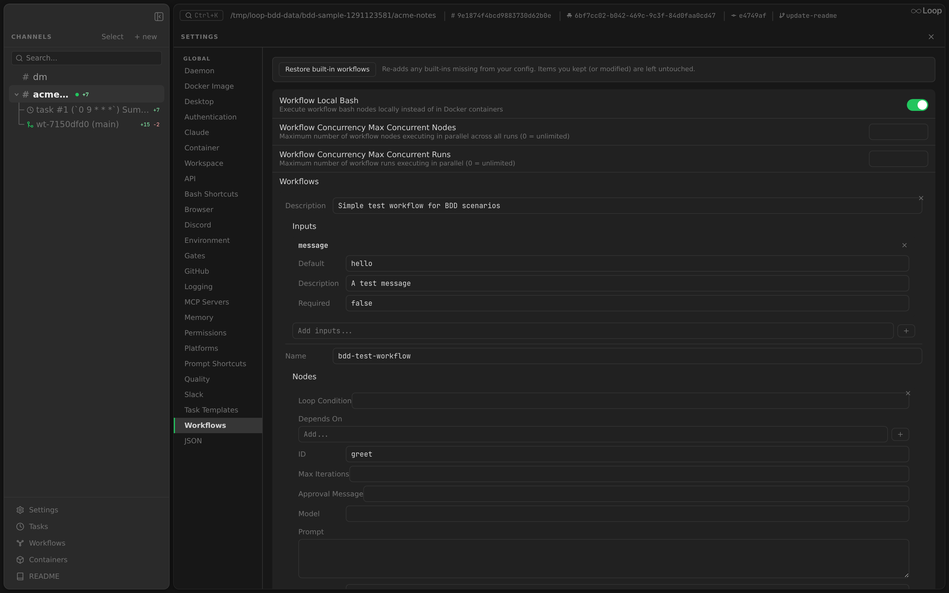
The Settings panel (src/components/shared/Settings.tsx) opens as a full-width overlay that replaces the workspace layout. It can be opened from:
- Sidebar footer “Settings” button
- macOS app menu “Settings…” item (
Cmd+,) - Keyboard shortcut
Cmd+,/Ctrl+,
Press Escape to close.
Sections
The settings panel contains these sections from top to bottom:
Daemon
Displays the current daemon status and provides control actions.
Status Card
A dark card (colors.bg background, 8px border-radius) showing:
| Field | Display |
|---|---|
| Status | Green dot + “Running” (green text) or red dot + “Stopped” (red text) |
| Binary | Full path to the loop binary (word-break, right-aligned) |
Restart Button
A full-width button with a refresh icon:
- Normal: “Restart Daemon” with
colors.text - While restarting: “Restarting…” with spinning icon animation (
@keyframes spin) - Disabled while restarting
The restart flow:
- Calls
window.loopAPI.restartDaemon() - Main process runs
loop daemon:restart - Polls health check for up to 15 seconds
- Returns updated
DaemonInfo - Triggers
onDaemonRestartedcallback (refreshes channels)
App Settings
Two toggle rows with switch controls:
Stop Daemon on Quit
- Label: “Stop daemon when app quits”
- Description: “Uninstalls the daemon service on quit. It will be re-installed on next app launch.”
- Default:
false
When enabled, the before-quit handler runs loop daemon:stop.
Auto-Save Editor on Blur
- Label: “Auto-save editor on blur”
- Description: “Save open editor tabs when the window loses focus. Manual save with Cmd+S always works.”
- Default:
true
This setting affects the Editor panel behavior.
Islands Layout
- Label: “Islands layout”
- Description: “Panels float as rounded cards over a deep canvas background with gaps between them.”
- Default:
true
When enabled, each panel (sidebar, split panes, tab bar, settings, etc.) renders as a rounded island with subtle shadows and borders, separated by transparent gaps that reveal a deeper canvas color underneath. When disabled, the UI reverts to the classic flat tiled layout with 1px border separators. The setting is applied live — no restart required.
Toggle Switch UI
Each setting is a clickable row with:
- Label text (13px) and description (11px, dimmed) on the left
- A 36x20px toggle switch on the right
- Off:
colors.borderbackground - On:
colors.active(green) background - White 16px circle knob with CSS transition on
left(2px or 18px) - 0.2s transition on background color and position
- Off:
Settings are persisted to ~/.loop/app.json via the save-settings IPC handler.
Directories
Only shown when a specific project channel is selected (via the gear icon on a channel item in the sidebar).
Displays the channel’s root directories: the primary dir_path and any extra directories. You can add additional directories to create a multi-root workspace — useful when a project depends on code in separate directories (e.g., a shared library or a protobuf definitions repo).
- Add – click the “+” button and select a directory to add as an extra root
- Remove – click the remove button next to an extra directory to remove it
Extra directories are stored in the project config (.loop/config.json → extra_dirs) and affect the editor file tree
, container mounts, and the Claude CLI --add-dir flags.
Global Config
Editable view of the global Loop configuration file at ~/.loop/config.json. Config is read and written via the HTTP API (GET /api/config, PUT /api/config), so it works in both the Electron app and browser dev mode.
Form / JSON Toggle
A pill toggle in the section header switches between two views:
- Form — schema-driven form with typed controls, rendered from the JSON Schema returned by
GET /api/config/schema - JSON — raw HJSON editor (textarea) for direct text editing
The active view is remembered while the Settings panel is open. Both views edit the same underlying config; switching from JSON to Form re-parses the text.
Form View
Each config field renders as a typed control based on its schema:
| Schema Type | Control |
|---|---|
boolean | Toggle switch |
string with enum | Dropdown select |
string with format: "password" | Password input with show/hide toggle |
string | Text input |
integer / number | Number input |
array of string enum | Multi-select pills |
array of string | Editable list (add/remove items) |
object (key-value) | Key-value editor rows |
Nested objects (e.g. browser, memory, mcp, gates) render as collapsible groups. gates is the deepest-nested example: it contains agentgate and docker_proxy sub-objects, each with arrays of rules whose items are themselves objects (and body_rules items contain a nested json_checks array of objects) — all rendered without custom widgets via the generic object-array row.
JSON View
- Full-width textarea (200-400px height, resizable vertically)
- Monospace font, 12px, 1.5 line-height
- Syntax is HJSON (JSON with comments and trailing commas)
- Red border when there is a save error
Keyboard shortcuts in JSON view:
| Shortcut | Action |
|---|---|
Cmd+S / Ctrl+S | Save the config |
Escape | Cancel editing (stops propagation to prevent closing Settings) |
Tab | Insert two spaces (no focus change) |
Restore built-ins
When the active section is Workflows or Prompt Shortcuts, a “Restore built-ins” bar sits above the section’s content. Clicking it re-seeds any missing built-in entries via the same fsmigrate seeders used during onboard:
- Workflows:
review-loopandreview-fix-loop. - Prompt shortcuts:
builtin code reviewandbuiltin simplify.
The bar reports which entries were added vs. already present, and re-fetches the global config on success so the newly-seeded entries appear in the form below. The seeders are skip-if-name-exists, so user-edited entries (or entries the user has intentionally deleted-and-replaced) are never overwritten — this affordance is for restoring deletions, not for resetting to defaults. Backed by POST /api/builtins/restore with {"kind": "workflows"} or {"kind": "shortcuts"}.
Saving
- “Save” button writes config via
PUT /api/config. Shows “Saving…” while in progress. Displays error message on failure. Cmd+S/Ctrl+Skeyboard shortcut saves from either view.
Unsaved Changes
When there are unsaved changes and the user tries to close Settings or switch to a different channel, a confirmation modal appears with three options: Save, Discard, and Cancel (stay on the current view).
Project Config
Only shown when a specific project channel is selected (via the gear icon on a channel item in the sidebar).
- Displays the project-level config at
<dir>/.loop/config.json - Same Form/JSON toggle UI as Global Config, backed by
GET /api/config/projectandPUT /api/config/project - If the file does not exist, shows: “No .loop/config.json found – click Edit to create one.”
- Editing creates the
.loop/directory and file if needed
Header Bar
The settings panel includes a header bar matching the workspace layout header:
| Element | Description |
|---|---|
| Toggle sidebar button | Same as workspace (chevron icon) |
Search button (Cmd+K) | Opens the Command Palette |
| “SETTINGS” label | Uppercase, dimmed, 10px |
| Close button (X) | Closes the settings panel |
Command Palette
The Command Palette (src/components/shared/CommandPalette.tsx) is a spotlight-style search overlay for quick navigation to channels, threads, and messages.
Opening
| Trigger | Notes |
|---|---|
Cmd+K / Ctrl+K | Global keyboard shortcut (toggles open/close) |
| Search button in workspace header | Opens the palette |
| Search button in settings header | Opens the palette |
UI Layout
- Backdrop: Fixed overlay covering the entire window,
rgba(0, 0, 0, 0.5)background. Click to close. - Dialog: 520px wide, max 400px tall, centered horizontally, 80px from top
colors.surfacebackground, 8px border-radius, 1px border- Deep shadow:
0 16px 48px rgba(0, 0, 0, 0.4)
Search Input
- Full-width text input at the top of the dialog
colors.bgbackground, 6px border-radius- 14px sans-serif font
- Placeholder: “Search channels, threads, and messages…”
- Auto-focused on open
State Reset
When the palette opens:
- Query is cleared
- Selection index reset to 0
- Message results cleared
- Search state reset
Result Types
The palette displays three types of results:
Channels
| Field | Display |
|---|---|
| Icon | # hash symbol |
| Label | Channel name or dir_path |
| Detail | `dir_path |
Threads
| Field | Display |
|---|---|
| Icon | Tree branch symbol |
| Label | Thread name |
| Detail | <parent-name> > thread |
Messages
| Field | Display |
|---|---|
| Icon | Speech bubble emoji |
| Label | Message content (truncated to 80 chars, single-line, monospace font) |
| Detail | <author_name> in <channel_name> |
Messages appear in a separate section with a “MESSAGES” header and a top border separator.
Fuzzy Matching
Channel and thread filtering uses fuzzy matching: each character of the query must appear in order in the target text (case-insensitive), but not necessarily consecutively.
function fuzzyMatch(query: string, text: string): boolean {
  const q = query.toLowerCase();
  const t = text.toLowerCase();
  let qi = 0;
  for (let ti = 0; ti < t.length && qi < q.length; ti++) {
    if (t[ti] === q[qi]) qi++;
  }
  return qi === q.length;
}
Both the item label and detail text are checked.
Message Search
Message search runs against the backend API (GET /api/messages/search?q=...).
| Property | Value |
|---|---|
| Debounce | 300ms |
| Minimum query length | 2 characters |
| Maximum results | 10 |
| Search method | LIKE %query% in the database |
| Sort order | created_at DESC (most recent first) |
While searching, “Searching messages…” is shown below the results.
Keyboard Navigation
| Key | Action |
|---|---|
ArrowDown | Move selection down |
ArrowUp | Move selection up |
Enter | Accept the selected item |
Tab | Accept the selected item |
Escape | Close the palette |
The selected item is highlighted with colors.selectedBg background. Mouse hover also updates the selection index. The selected item is scrolled into view with scrollIntoView({ block: "nearest" }).
Selection Actions
| Result Type | Action on Select |
|---|---|
| Channel | Navigate to the channel (set selectedId) |
| Thread | Navigate to the thread (set selectedId) |
| Message | Navigate to the message’s channel and scroll to the message (via scrollToMessageId) |
After selection, the palette closes. For messages, the chat view:
- Loads messages around the target using
aroundpagination - Scrolls the target message into view (centered)
- Highlights the message with an indigo flash (see Chat - Highlighted Messages )
Combined Navigation List
Channel/thread items and message items are combined into a single list for keyboard navigation. The selection index spans both sections:
- Indices 0 to N-1: filtered channels and threads
- Indices N to N+M-1: message results
This allows seamless arrow-key navigation across both sections.