Sidebar & Navigation
The sidebar provides the primary navigation structure for the Loop desktop app. It lists channels and threads, supports drag-and-drop reordering, batch selection, search filtering, and houses the app’s footer actions.
Related docs: Desktop App | Layouts | Settings | Chat
Layout
The sidebar is a vertical column on the left side of the app with the following sections, top to bottom:
- Drag region (38px) – macOS window dragging area with a collapse button at the top-right
- Header bar – “CHANNELS” label with Select and “+ new” buttons
- Search box – filter channels and threads
- New channel input – inline text field (shown when creating)
- DM channel – pinned at top
- Project channels – sortable list with collapsible threads
- Spacer – pushes footer to bottom
- Footer – update button, settings, README
- Resize handle – right edge for width adjustment
Dimensions
| Property | Value |
|---|---|
| Minimum width | 180px |
| Maximum width | 25% of window width |
| Default width | 280px |
The width is adjusted via a 4px-wide resize handle on the right edge:
- Cursor changes to
col-resizeon hover - Handle becomes visible (
colors.textDim) on hover and during drag - A 1px border-right (
colors.border) is always visible user-select: noneis applied during drag to prevent text selection
When collapsed (sidebarOpen === false), the entire sidebar is hidden (returns null). An expand button appears in the workspace layout’s top drag region to restore the sidebar.
Channel Ordering
Drag-and-Drop
Top-level channels (not threads, not DM) support drag-and-drop reordering:
- Each
ChannelItemhasdraggableset on its container. - On drag start, the channel ID is stored in
draggedIdRef. - On drag over, the target channel shows a green top border (
2px solid colors.active). - On drop, the channel order array is updated: the source is removed from its position and inserted at the target position.
Persistence
Channel order is stored in localStorage under the key loop-channel-order as a JSON array of channel IDs. Channels not in the stored order sort to the end.
Search
The search box sits below the header and provides real-time case-insensitive filtering.
Behavior
- Filters top-level channels by name match
- Shows a parent channel if any of its threads match (even if the parent name does not match)
- When the parent matches, all its threads are shown
- When only threads match, only those matching threads are shown under the parent
- Press
Escapeto clear the search query
UI
- Search icon (magnifying glass) positioned inside the input field (left-aligned)
- Input: full width,
colors.bgbackground, 12px font, 4px border-radius - Placeholder: “Search…”
Selection Mode
Clicking “Select” enters batch selection mode.
Behavior in Select Mode
- Each channel and thread shows a checkbox instead of the collapse chevron
- The DM channel is excluded from selection (pinned, not selectable)
- Checked items have a green border and background with a checkmark icon
- Header shows:
- “Delete (N)” button – deletes all selected items (red on hover)
- “Cancel” button – exits selection mode and clears selections
Batch Delete
Channels and threads are deleted individually in sequence. If the currently selected channel is among the deleted, the selection is cleared.
Create Channel
Clicking “+ new” opens a dropdown menu with two options:
| Option | Action |
|---|---|
| New project | Shows an inline text input in the sidebar. Enter submits, Escape/blur cancels. |
| Open directory… | Opens a native directory picker dialog (via showOpenDirectoryDialog IPC), then runs onboard:local and creates/selects the channel. Only available in Electron. |
The dropdown is a positioned overlay that closes on outside click (left mousedown).
DM Channel
The DM channel is always pinned at the top of the channel list:
- Identified by
name === "dm"and noparent_id - Created automatically on first load if it does not exist (
ensureChannel) - Auto-selected on first load if no channel is selected and no hash is present
- Cannot be deleted (excluded from context menu delete option)
- Cannot be selected in batch selection mode
Channel Item
Each channel item (ChannelItem component) displays:
Visual Elements
| Element | Description |
|---|---|
| Collapse chevron | Shown when channel has threads. Rotates 90 degrees when collapsed. Click to toggle. |
Hash symbol (#) | Channel prefix, dimmed text |
| Channel name | Truncated with ellipsis. Shows dir_path.split("/").pop() if no name set. |
| Status pills | rev (colors.active) when a review session is open, ask (colors.warning) when an agent is parked on an AskUserQuestion card. Pills come from store refs (reviewChannelIdsRef, askUserChannelIdsRef) that are kept in sync via WebSocket events and rehydrated on reconnect against /api/review/sessions and /api/asks/pending. |
| Status indicator | Green dot (6px circle, colors.active) when container_running or agent_running is true |
| Config button (gear icon) | Shown on hover for channels with dir_path. Opens project settings. |
| “+ thread” button | Shown on hover. Toggles the new thread input. |
Interaction
| Action | Behavior |
|---|---|
| Click channel name | Select the channel |
| Click collapse chevron | Toggle thread visibility |
| Double-click channel row | Collapse/expand threads |
| Hover | Shows config and thread buttons; applies colors.hoverBg background |
| Right-click | Opens context menu |
| Drag | Initiates channel reorder |
Context Menu
Right-clicking a channel opens a context menu with:
| Item | Action |
|---|---|
| Copy Link | Copies loop://channel/<id> to clipboard |
| Copy Channel ID | Copies the raw channel ID |
| Delete Channel | Deletes the channel (not shown for DM) |
The “Delete Channel” item has danger: true styling (red text) and a separator above it.
Thread Item
Hovering a channel row reveals a +wt button; clicking it opens a branch picker (portaled just below the button) to spin off a git worktree from any branch — the worktree opens as its own thread under that channel.
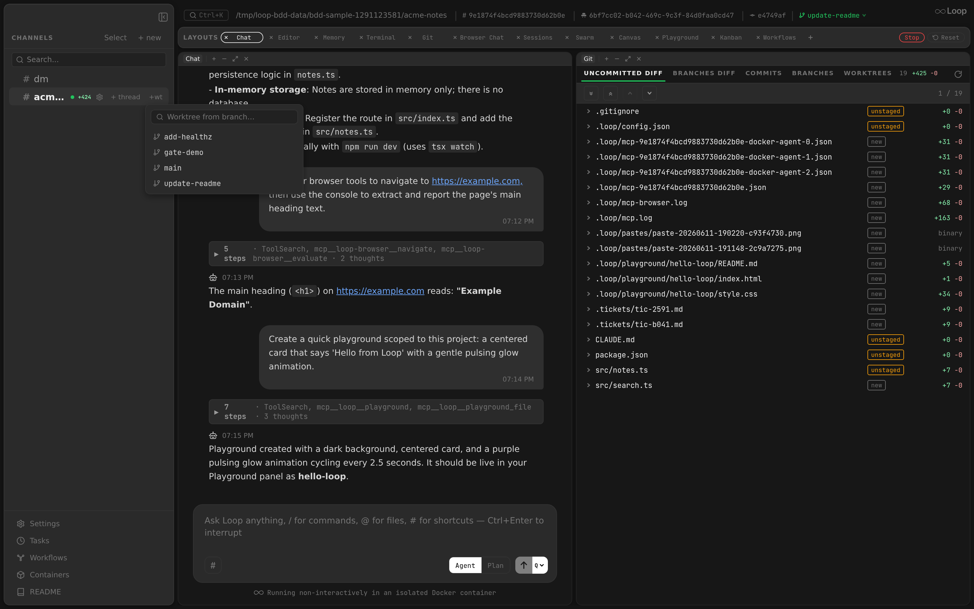
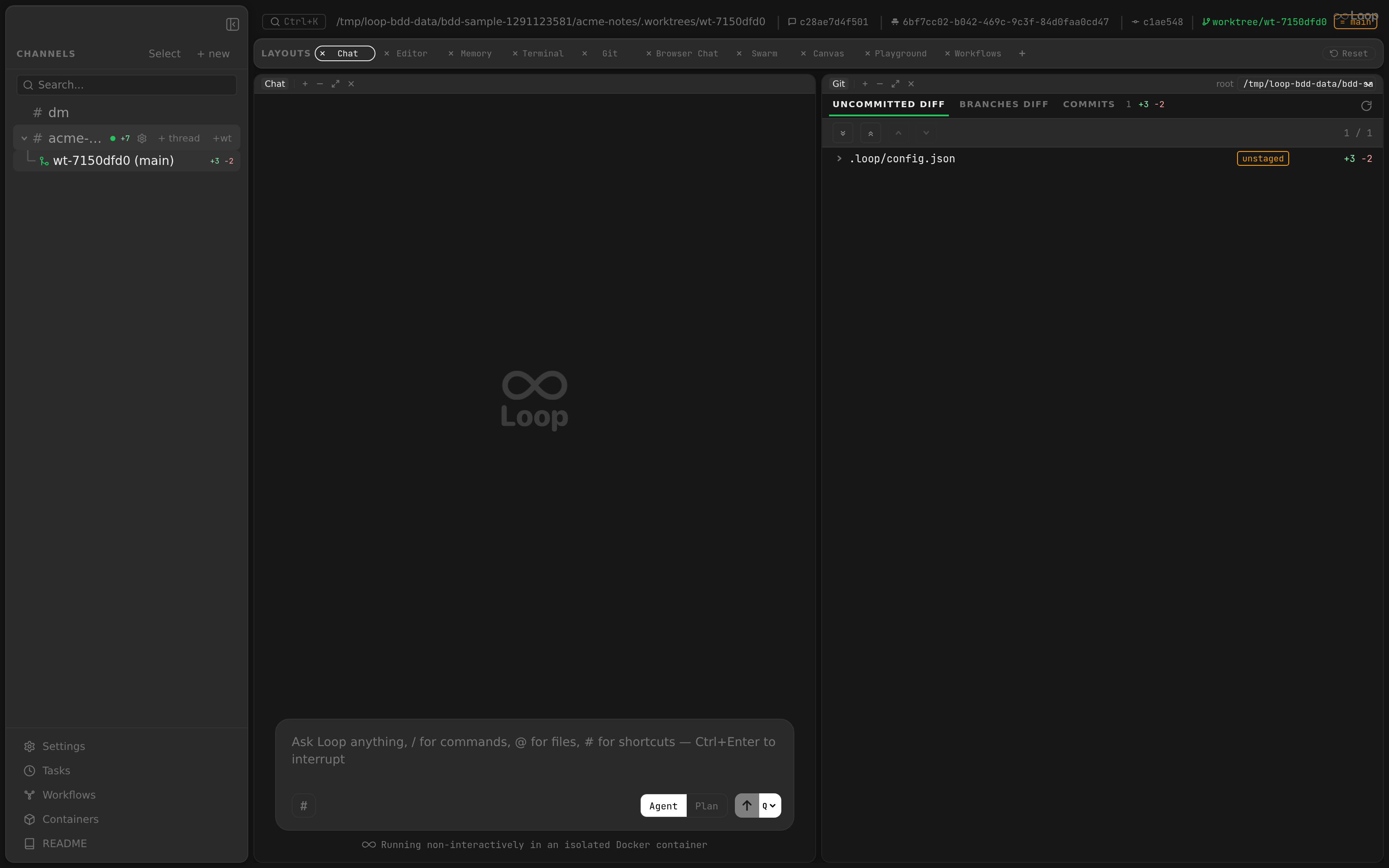
Threads are listed below their parent channel, indented with a tree connector line. Threads can contain sub-threads (e.g. scheduled task threads), forming a 3-level hierarchy.
Visual Elements
| Element | Description |
|---|---|
| Tree connector | SVG with vertical line and horizontal branch at 50% height. Last thread’s vertical line stops at 50%. Positioned at 16px left offset. Z-index 1 to stay above hover backgrounds. |
| Worktree icon | Git branch SVG icon (colors.active) for worktree threads. |
| Task thread icon | Clock SVG icon (colors.textDim) for scheduled task threads (detected by task # name prefix). |
| Ephemeral icon | Undo-arrow SVG icon (60% opacity) for ephemeral task threads (detected by [ephemeral] prefix). |
| Thread name | Truncated with ellipsis. Task thread names have emoji prefixes (🧵, ⏱) stripped for display. Falls back to thread ID. |
| Status pills | Same set as channels: rev for an open review session and ask when an agent is parked on an AskUserQuestion card. |
| Status indicator | Green dot when container_running or agent_running, positioned at the right edge. |
| Checkbox | Shown in selection mode instead of normal layout |
| Sub-threads | Rendered recursively below the thread with the same connector style. |
Indentation
Threads are indented with padding-left: 30px (accounting for the tree connector). The connector line uses colors.textDisabled (#555555) at 1.5px stroke width.
Interaction
| Action | Behavior |
|---|---|
| Click | Select the thread |
| Hover | colors.hoverBg background |
| Right-click | Opens the same context menu as channels |
Create Thread
Clicking “+ thread” on a channel reveals an inline input (NewThreadInput) below the channel. Behavior:
Entersubmits the thread nameEscapeor blur cancels- The input auto-focuses on mount
Delete Thread
Threads can be deleted via:
- Context menu “Delete Channel” (same operation for threads)
- Batch selection mode
Footer
The footer sits at the bottom of the sidebar, separated by a top border.
Update Button
Only shown when updateStatus?.available is true. The button text and behavior depend on the update state:
| State | Text | Color | Action |
|---|---|---|---|
| Available | “Update available vX.Y.Z” | colors.active (green) | Download update |
| Downloading | “Downloading…” | colors.textDim | Disabled (no action) |
| Downloaded | “Restart to update” | colors.active (green) | Install and restart |
| Error | “Update failed – click to retry” | colors.active | Retry download |
The button includes a download icon (arrow into tray).
Kanban Button
- Board icon + “Kanban” text
- Click opens the Kanban panel as an overlay
colors.textDimtext, brightens on hover
Settings Button
- Gear icon + “Settings” text
- Click opens the Settings panel
- Keyboard shortcut:
Cmd+,(handled at the app level) colors.textDimtext, brightens on hover
README Button
- Book icon + “README” text
- Click opens the README markdown panel
colors.textDimtext, brightens on hover
Window Title
The app title bar updates based on the selected channel/thread (handled in App.tsx):
| Selection | Title |
|---|---|
| None | Loop |
| Channel | <channel-name> - Loop |
| Thread | <parent-name> > <thread-name> - Loop |